

Apps built to work, not to impress reviewers.
Every project below is in production. No concept work, no pitch decks — real interfaces used by real people every day.
What was removed, not just built.
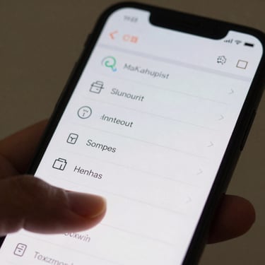
FieldRoute
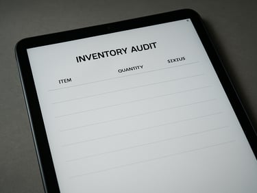
StockCheck
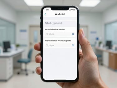
IntakeNow
Replaced a seven-screen dispatch flow with two. Task completion time dropped. Navigation depth: two taps from launch to action.
Eliminated the onboarding wizard entirely. Users scan and confirm in one gesture. Zero training sessions required at client launch.
Cut a 14-field intake form to six required fields. Error rate at submission fell by half. One screen per question, no branching menus.

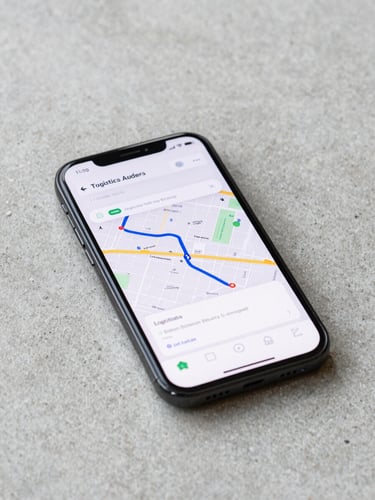
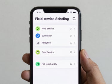
RouteSync: clarity as the spec.
The original brief asked for live tracking, driver messaging, and a reporting dashboard. We shipped tracking only — because the other two were solving problems the client didn't have yet.
Navigation depth: three taps from cold launch to active route. Onboarding steps: none. The app explains itself through structure, not instructions.